


GATORADE GX: INFLUENCER TOOL
Empowering coaches to monitor
the fueling needs of their team.
Responsive Web Design (2017)
Currently being used by international soccer to college
sports teams, and NFL to NBA, Gx is a holistic digital
/physical platform that services the hydration and fueling
needs of athletes, based on their inner/physical differences,
weather conditions, exertion levels, and exercise duration
that they might experience across a variety of activities.
ROLES
UI DESIGN
INTERACTION DESIGN
PROTOTYPING


The Influencer Tool is a responsive web app that provides coaches the ability to schedule activies and review athlete hydration data.
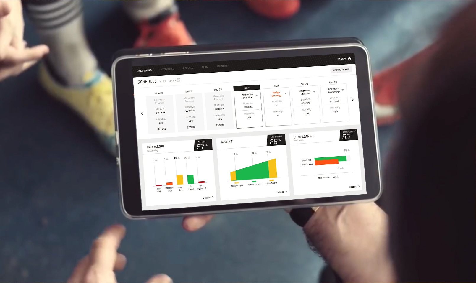
THE DASHBOARD
The dashboard is the main view of the tool where coaches can schedule activities on a weekly basis as well as see analytics on their team hydration, weight, and compliance from the previous activity. Based on feedback, coaches wanted a quicker way to interpret the data being shown.


REDESIGNING THE DISPLAY
OF COMPLIANCE DATA
The hydration, weight, and compliance graphs could all look the same based on the type of data being shown (# of athletes divided into different classifications). However, they were visually designed differently so coaches could distinguish between them at a quick glance. Out of the three graphs, some coaches had trouble interpreting the information for compliance quickly.
VISUAL EXPLORATION
As I was exploring different ways to visualize compliance information, two considerations came up as color become a major part of the design.
1. Was the # of athletes not checking out as important as # of athletes that didn't check in at all?
2. What was the right balance of visually distinct and easy to interpret?


BRINGING CONTEXT
THROUGH COLOR
Part of the trouble for coaches interpreting the data was that the colors used on the platform were exclusively black and grey. This was easier to handle when they were in their offices, but when they were out in the field or on the go, looking on a phone/tablet required a quicker read of the information.
By utilizing the risk level colors used in the previous version of Gx, the graphs could quickly help coaches understand which athletes to pay attention to.
TESTING VARIATIONS
We tested out three different solutions under the assumptions that coaches knew that the colors
green, yellow, orange, red) represented risk. The third solution ended up being the most clear to coaches.
In each idea, the copy reflects the changes as well.


RESULTS
The Results tab allows coaches to go more in depth on their team's hydration, weight, and compliance from
revious activities. Here they can see how each athlete is doing and which ones they need to be aware of.


REDESIGNING
RESULTS
Coaches felt that the results screen did not provide much detail as it was aggregating the results for the whole week as opposed to the daily view, which was important when they wanted to follow up with certain athletes about the activity that day. I redesigned them based on the assumption that their coaches could
better act on the data if they can see what happened each day, in addition to a weekly summary.
EXPLORATION
Some considerations I kept in mind were that it was more than just a matter of showing the results from each day in a weekly view. Within the context of a week, I explored different ways to access the information based on the kind of information coaches were looking for.
• Within context of a week, having a sidebar
made sense to dive deeper into specific
days
• Showcasing activity details for each day
helps give coaches more context to how
their athletes performed
• Using red to highlight those at high risk/
overhydrated help call out the most critical
athletes to pay attention to


THINKING THROUGH
CONTEXT
Although each results data set being shown was tracked each day based on athletes weighing in, the way in which they were displayed had to be different based on
what the coaches felt was important.
For example, daily fluctuations in weight did not
matter to coaches, so the numbers would never
be highlighted in red as (risk). And for
compliance, data could be easier to digest
through iconography instead of numbers.
FINAL DESIGNS


