


CURATE
Helping men discover fashion in the
context of what they already own.
Mobile App Design (2016)
Men want to look as good as possible while
spending little time and effort putting together outfits.
Curate aims to do that, without having users ever to take a single picture.
ROLES
PROJECT MANAGEMENT
VISUAL DESIGN
INTERACTION DESIGN
USER RESEARCH
PROTOTYPING
1/Background

Men want to look as good as possible while spending little time and effort putting together outfits.
This was the final group project at General Assembly where I worked with the founders of the app Curate. As the app was getting ready for it's launch in 2016, the founders challenged us with figuring out how the algorithm for outfit matching would work and explore how the 'Settings' and shopping experience would look like.
I acted as the project lead in a team of 3 UX designers. In addition to contributing to the UX phase of the project, I solely worked on the visual design/branding phase as well.
2/Discovery
We were given a certain demographic in mind to design for, a 22 year old male fresh out of college, working in finance who is in need of a major wardrobe overhaul.
In the current build of the app, only the onboarding was working so we tested it with men ages 22-28 and found that the user experience was inefficient in capturing user input as well as suffering from UI issues such as lack of clarity and irrelevant copy/tone. We proposed on conducting more research as to what the target users' needs and goals were.


Selected screens from current onboarding experience.
COMPARATIVE RESEARCH
We surveyed the fashion landscape within tech and looked at a variety of services that focused on fashion discovery, styling services, and clothing archiving.
• Most sites focused on fashion discovery and styling services don’t work with the context of what users own already
• Platforms for clothing archiving required users to take their own images


USER SCREENER & INTERVIEWS
We surveyed 86 people ages 18–51 to help us find interviewees that had a wide range of style, fashion consciousness, and shopping behavior. Through the interviews we were able to spot key trends to guide our design solutions, such as the fact that our users dressed first for the activity, then weather, followed by their mood.
DEFINING OUR USERS
Through affinity mapping, we synthesizd our interviews and created two distinct personas/user stories of how the app would be used.
Primary Persona: Andy cares about efficiency when getting dressed
Secondary Persona: Jeremy cares about standing out and discovering new brands that are similar to his style


3/Define
The goal was to release the MVP within 2 months, so we wanted to make sure a personalized onboarding and basic outfit suggestions were working.
For the MVP, outfit curation would be based on the weather (using location services) and activity, which is decided by color and garment type. In the future, brands and material could also factor into the algorithm.
CONTENT STRATEGY
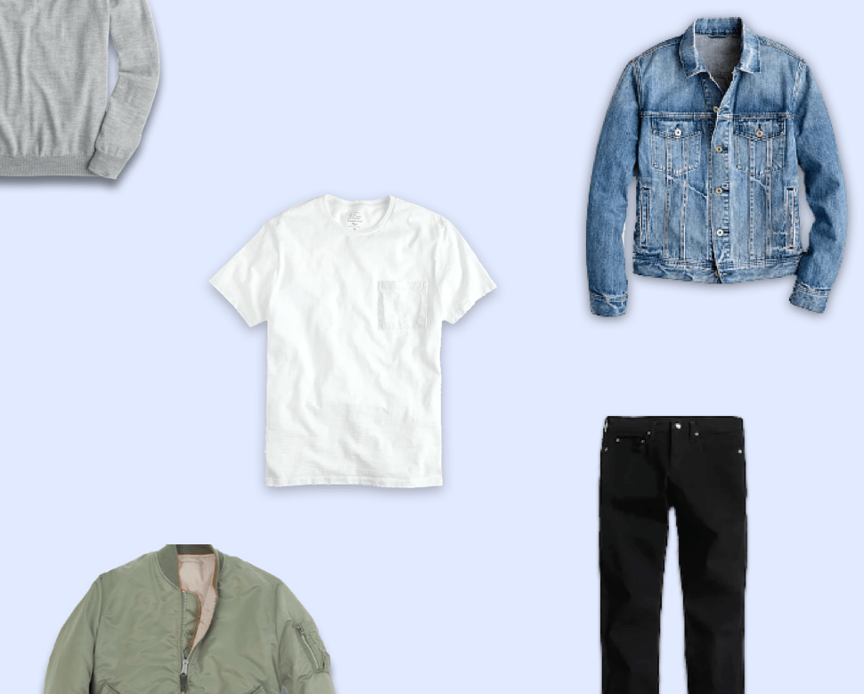
Figuring out the right garments to put into the app required further research as to what our target users already own. Due to timing, we looked online for silhouettes major men’s retailers offered and the most popular colors they came in. For example, navy peacoats, white tees, dark blue jeans, etc.

4/Develop

Our users don’t want to be
overwhelmed with choices,
so it was important to help
limit their decision making
whenever possible.
Our users don’t want to make overwhelmed with choices as they want to just be given a suggestion of what to wear, so it was important to help limit their decision making whenever possible. If they don’t like the outfit combinations or new items served to them, they can always improve the algorithm by favoriting/disliking the content pushed to them.
INFORMATION ARCHITECTURE
The Curate experience consists of three main tabs.
Outfit Builder
The main experience as to which users are presented with when they open up the app. Only one outfit is ever shown as the core decision users make is selecting the activity or weather they are getting dressed for.
Discover
Through this tab, users are served only items that the algorithm believes are the best choices for what goes with items the user already owns. Users can buy the item through affiliate linking, along with favoriting/disliking to help improve the algorithm.
Closet
This is the section where all the garments that the user owns are stored. They can tap on individual pieces to see recommended outfits that go with them.


WIREFRAMING
& ITERATIONS
Our goal for wireframing came down to specifically onboarding flow, accumulating infortaion about clothing, and changing outfits based on the weather/activity. We wanted to make sure that the user can get through onboarding quickly and that they could skip any parts we didn't need at the moment (sizes) due to shopping.
We made a prototype in Invision to test onboarding, clothing accumulation, and the changing of weather features with the target demographic. Our goals were to test for usability, copy language, and if the visual branding style resonated with users.


BRAND DEVELOPMENT
Although we were tasked with just UX design, we felt that the brand identity could be improved to match the target demographic, starting with the logo. The bowtie didn’t resonate with most of the users as they didn’t own one, nor could they ever imagine wearing one.
The new logo took advantage of the clothing hanger and integrated it with the 'C' in Curate. The primary blue color was chosen based on the fact that it makes the product trustworthy and safe. It also helps it stand out in a sea of fashion apps that focus primarily on black/white.


DEFINING THE
BRAND QUALITIES
When designing the UI, I started with the brand qualities based on the mission of Curate- fun, trustworthy, and inspirational. I then created mood boards on Pinterest from various sites, apps, posters, packaging that I felt captured those qualities.
5/Deliver
Once the client agreed on the branding style, i applied the new visual language to the overall look and feel, based on the goals of discovery new outfits and what users do.
ONBOARDING
We paid alot of attention to copy as text itself is also part of the user experience. User input here would determine the algorithm for the content served to each individual user. In addition, we shaved off 4 screens and 8 actions compared to the original onboarding.


OUTFIT BUILDER
Main experience of the app where users can create outfits based on just the weather, activity, or both. Ability to save or edit outfits lets users engage more if they wanted to.


CREATING DELIGHT
Since app-generated outfit curation is the main goal of the app, I wanted to provide users a fast and simple experience every time they open it. Apps like Shazam and Hungry Now do that really well by having users open and just tap one button to get what they want.
By taking advantage of the logo’s button like characteristic, users can generate a whole new outfit right when they open the app with each tap. If they don’t like it, they could keep tapping the button to generate new outfits.
CARD BASED UX
I opted for a card based UX as I wanted users to dive into the outfits when relevant to them to take more action, such as editing an outfit or discovering a new one.


CREATING OUTFITS FROM
SELECTED GARMENTS
Besides starting with the weather, users are able to select a garment and outfits could be generated from their selection as well.
CONTEXTUAL SHOPPING
Users mainly discover new clothing styles through the context of what they're dressing up for. Every shoppable silhouette that is shown to them is paired with other pieces by the algorithm.

